Dark Mode for Rosetta Stone
2020 Innovation Project
My role: UI Designer
Team: UX designer / Front-end Developer
Time: 5 days
During a quarterly innovation sprint, two of my colleagues and I worked together to quickly research, document and design a dark mode theme for Rosetta Stone’s flagship product for consumers, Foundations.
A dark mode theme is a low-light user interface that displays mostly dark surfaces. We advocated for this feature due to the following benefits for our learners:
reducing eye strain by adjusting brightness to current lighting conditions
facilitating screen use in dark environments – all while conserving battery power
What challenges did we face designing a theme for Dark Mode?
A “dark theme” displays dark surfaces across the majority of a UI and places the focus on the contents and less on the interface. When creating a dark theme, it’s not as simple as inverting colours from white to black. Instead, the most essential colours need to be defined.
This means that dark grey becomes the primary surface colour for components. Dark grey is also used to express elevation, meaning that the higher the surface elevation, the lighter that surface becomes. Lightness was achieved by applying a semi-transparent colour overlay on top of the surface colour. For example, that overlay could be white or a primary colour.

This took a bit of trial and error but helped to define the background, foreground, text, primary and secondary colours.
Luckily for us, our primary and secondary brand colours work well in dark mode.

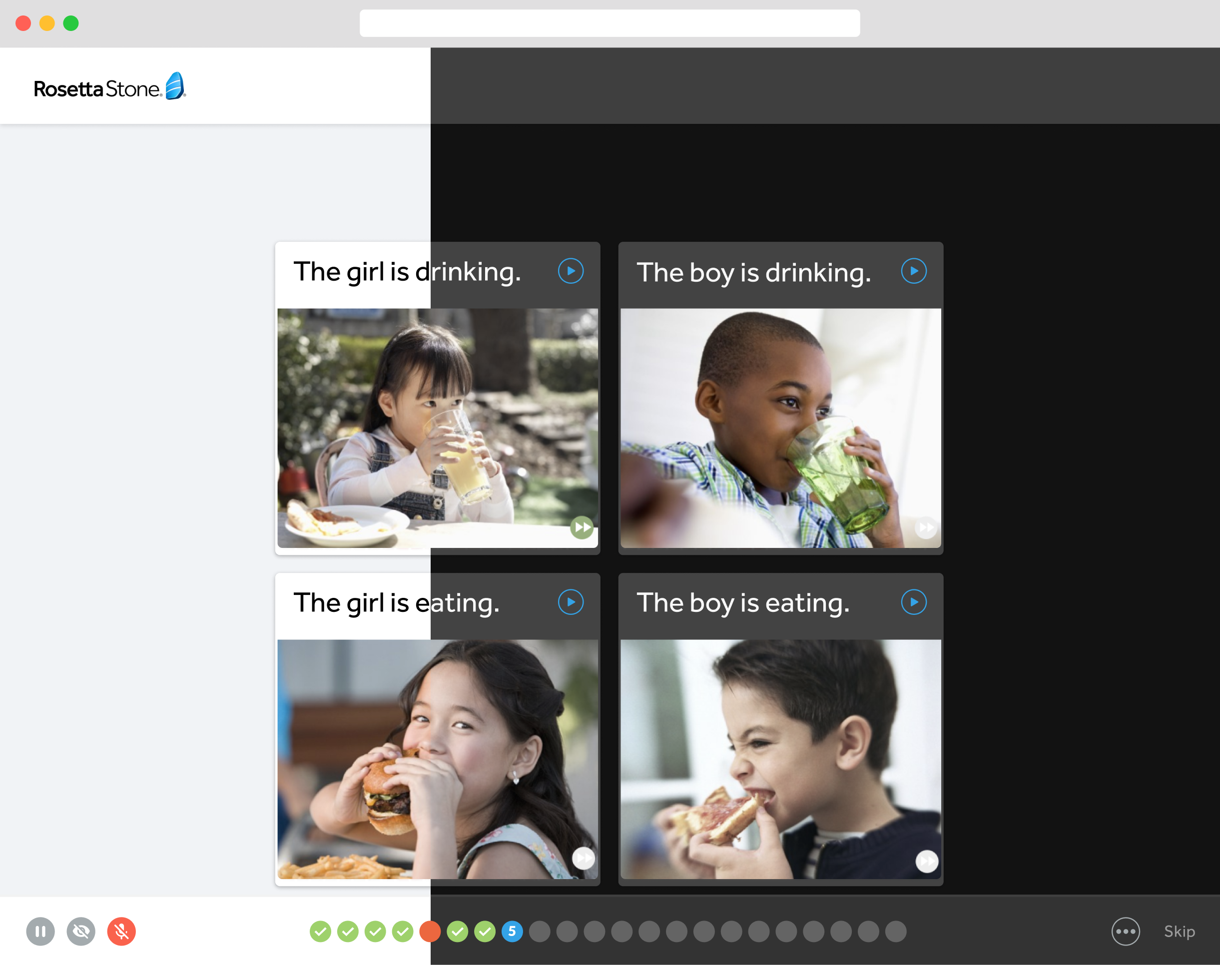
Final presentation
So, with these discoveries in mind, three principles were adhered to while designing the theme:
Darken with grey rather than black. This is more effective in showing elevation and space, as it gives the user interface a wider range of depth.
Apply limited colour accents within the user interface, so that the majority of space is dedicated to dark surfaces.
Enhance accessibility by accommodating regular dark theme users (such as those with low vision), in order to meet accessibility colour contrast standards.
Once designs were completed, we presented our work to the Product Team. Although this feature was not implemented, it was very well received by top management.
